I think it’s worth noting the broad cycles that Morgan Stanley has had over many years. Below I’ve shown (with a bit of help from Mr. Roper) what the moving averages have illustrated about Morgan’s moves over the decades. To my eyes, it seems to have peaked, as it has twice before.
Slope of Hope Blog Posts
Slope initially began as a blog, so this is where most of the website’s content resides. Here we have tens of thousands of posts dating back over a decade. These are listed in reverse chronological order. Click on any category icon below to see posts tagged with that particular subject, or click on a word in the category cloud on the right side of the screen for more specific choices.

Semi Equipment Spending Record, 2018 Growth, But…
What got me checking into the SEMI data is a goofy MarketWatch article featuring a fund manager who owns the FAANG type stocks at 30 multiples, but has found relative value in AMAT and LRCX, the two Semiconductor Equipment stocks that I was bullish on 1.5 years ago. I know, I know… I sold too soon and that is my issue and I have to own it. But the point is that it was hard to buy then, unlike now.
 (more…)
The Cycle of the Small Caps

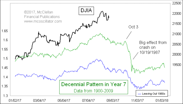
Seven
I was rather intrigued at the chart below, published over on John McClellan’s site. I can practically hear the snare drum in the background as we approach autumn.
SPX Cycles, Fed Funds and Gold
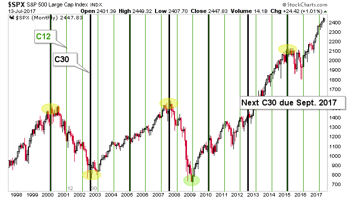
This “amateur cyclist’s” chart (I am anything but a cycles analyst) of the S&P 500 shows that the 12 month marker (C12) meant exactly nothing as the market remained firmly on trend, after brief pokes down in April and May. We noted that C12 was a lesser indicator than the 30 month cycle, which has coincided with some pretty significant changes (+/- a few months). That cycle (C30) is coming due at the end of the summer. Will it mean anything? Well, this market eats top callers for breakfast, lunch, dinner and midnight snacks. But it is worth knowing about to a lucid and well-armed market participant.