Slope of Hope Blog Posts

Slope initially began as a blog, so this is where most of the website’s content resides. Here we have tens of thousands of posts dating back over a decade. These are listed in reverse chronological order. Click on any category icon below to see posts tagged with that particular subject, or click on a word in the category cloud on the right side of the screen for more specific choices.

Oil, PBR in New Upleg? (by Mike Paulenoff)

By -

Oil prices pivoted off of key support at 87.25-86.80 last Friday in the aftermath of a decline from 92.58. Strength yesterday and today has the look and feel of a new upleg, which if accurate projects next to 94.60-95.20 — and, if that target zone is breached, onwards to 103-105. At this juncture, only a sudden downside reversal that breaks 87.25 will disrupt higher projections.

The move has benefited the US Oil Fund ETF (USO), as well as Petroleo Brasileiro (PBR), which we've been following. The daily chart on PBR shows the recent pullback from the Jan 3 high at 38.25 to the Jan 10 low at 35.89, which has the right look of a completed correction. Given today's strength, the chart has the look of a new upleg that should take out the prior high at 38.25 en route to still higher near-term target zones.

RCAPW21f3
Originally published on MPTrader.com.

Never-Ending Story (by Springheel Jack)

By -

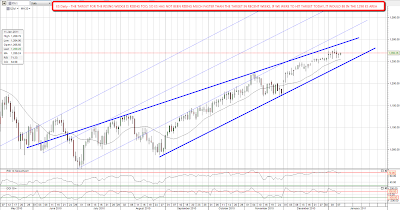
My feeling is that the top is probably in on copper and precious metals. I'm much less convinced that the same is the case on equities. ES has broken up through declining resistance from the recent high this morning, and that is adding to my feeling that equities aren't done yet. I've been expecting a hit of the upper trendline of my ES rising wedge on the daily chart, and unless we see ES 1250 broken then I'm still expecting to see that. That target trendline is rising as we chop around here and if we were to hit it today it would be just under 1290 ES:

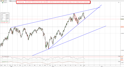
We are seeing signs that a top is near though. I haven't posted the gold:silver daily chart in a while as it has been in a steep decline since August, with the ratio dropping by a third in that time. There has been a very clear resistance trendline for that move though, and that trendline has now been broken. That suggests that a major interim top may well be near:

In terms of a commodities top the commodity currencies that I watch, mainly AUDUSD and CADUSD have remained strong while USD has been rallying. There are serious cracks appearing in AUDUSD now however, with the support trendline from June now breaking. If that is broken with confidence then I would expect AUDUSD to fall towards longer term support in the 90 area:

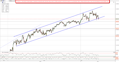
I'm watching the falling wedge on copper this morning to see whether it will hold today. It may well not, as the equivalent falling wedge on oil is already breaking up. I'm not expecting a new high on copper or oil, but they could yet broaden out into declining channels or make double tops. If it breaks up I'll be expecting a further move up of some kind while equities make a new high:

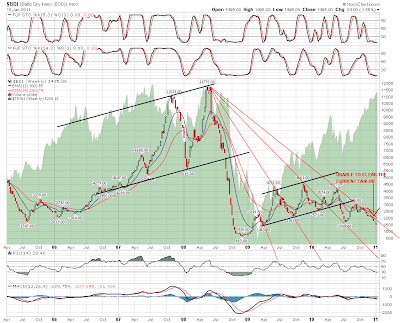
One chart that really struck me as interesting as I was going through charts this morning was the chart for the Baltic Dry Index. I've drawn a very nice fan on the $BDI chart and on a break up that would look very likely to lead to a significant further move up. The chart looks very weak though and BDI is still some 87.5% below the peak in 2008. That might be due to a glut in shipping ordered near the top of the last bubble but it is very interesting regardless that it has been quite so weak:

Sadly there is no BDI ETF. Does anyone know a decent way to trade the Baltic Dry Index?

Are We There Yet? (by Springheel Jack)

By -

The five week ES rising channel saw a serious pinocchio through it on Friday, and broke definitely overnight. The question now is whether equities have made the interim top already. Pug has his line in the sand at a close below 1257 SPX and I'd go with that. There's a potential H&S neckline at 1250 ES though, so we could well see a bounce there before further declines:

I've been giving a lot of thought to USD over the weekend as an analyst that I'm in correspondence with and respect a lot (but who doesn't wish to be named) tells me that he is expecting to see EURUSD bottom in the next day or two in the current area. That would be well short of my expectations but it could happen. Recent USD strength has been mainly about EURUSD weakness, and the commodity currencies particularly such as CADUSD and AUDUSD have remained strong while USD has been rising. Something to bear in mind and it isn't helpful that the EURUSD chart is a mess, without much in the way of useful shorter term support or resistance trendlines from the November top. On the USD weekly chart it has reached the top of the likely bull flag and we'll just have to see whether it can break above it. If it can then the next resistance level is 83.6 and I'd expect to see EURUSD fall to 1.26:

One currency that always amazes me with its strength is the Yen, as Japan is a debt-riddled stagnant disaster area. Nonetheless the Yen is seen as a safe haven for whatever reason, and shows no sign yet of becoming the killer short that it must one day become. On the ten year USDJPY chart there is a strong support trendline that was recently hit and a possible four year falling wedge. I'm expecting a move to the 87.5 area unless the USD rally does top out:

I haven't had a close look at copper so far this year so I thought I should review that this morning. On the big picture the rise since late 2008 has the look of a rising channel with the upper trendline recently hit. If it declines to channel support that would give us a target in the 350 area:

Has copper therefore made a major interim top? I think so. On the shorter term chart the support trendline for the move up since November was broken last week and the next obvious trendline support is in the 400 area. The decline so far has taken the form of a falling wedge which I'll be watching closely for direction:

One thing worth noting on the shorter term copper chart is the way that copper bottomed well before SPX in November. It will be well worth watching for directional clues as equities correct, as it should do the same again as the correction finishes.

Are We at Deflations Gate? (by BKudlaQA)

By -

In December my indicators told me to move into a short position regarding the miners, especially gold, and I did so.  Then during the Christmas break, the strength of the move forced me to dehedge and go longer, which I did.  So far so good on that, made some nice money and was feeling good going into the new year.

This week I spent the better part of it very sick and scrambling to sell things and rehedge, as I think I was hoodwinked by greed, and not paying enough attention to the low volume week, and its implications.

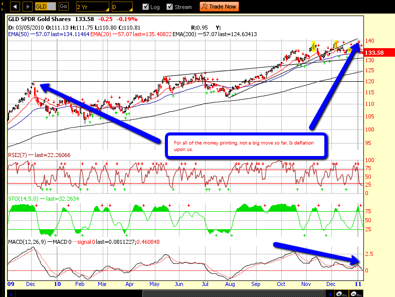
As part of my reflection, I started to look at charts from December 09 to see how the miners, and commodities in general have done in this so called stimulated environment.  Some interesting finds.

The large cap miners have done nothing, while gold is up 11%, this can't be good news for them if they break this horizontal support.

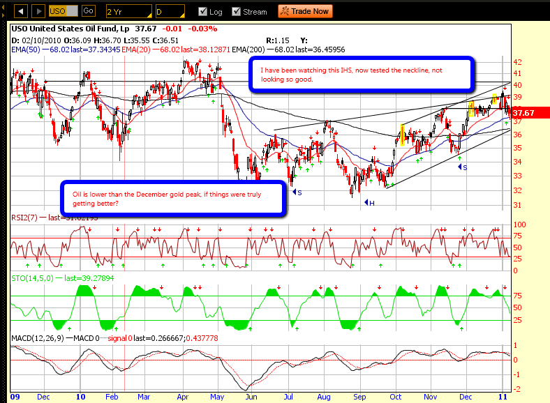
Oil has, really, done nothing, and looking at USO, it was forming IHS, and has turned back on the neckline.  I am watching this closely.

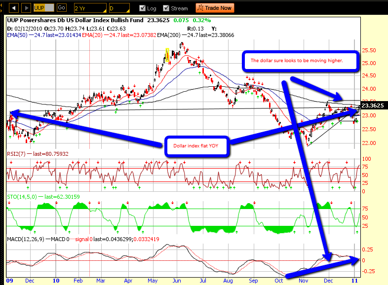
The dollar has gone nowhere, as well. Based on all that we are hearing about stimulus, you'd think the dollar is in the tank, nope.

The Euro, is down, and looks ready for the next leg down right now.  This cannot be good for the stock market.

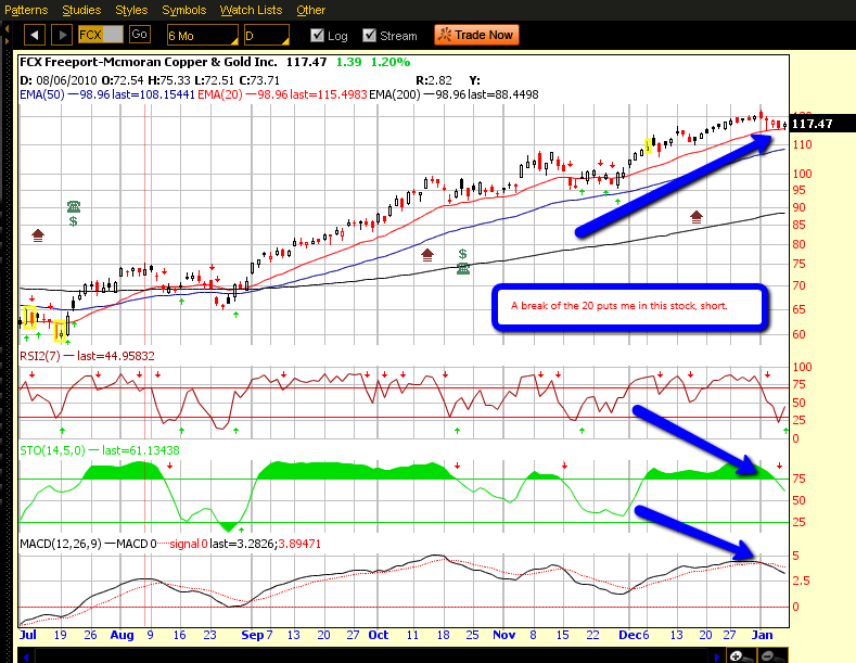
What is up is food and copper. Food I can understand, poor harvests, small commodity markets that can be overwhelmed with hot mney, etc.  Copper though is interesting, best I can guess, it is all about China, or is it.  I also hear that JP Morgan is controlling 80% of the metal in Comex, and has it warehoused, maybe a hedge against their silver exposure short.  If silver relents lower here, watch copper, also the China growth story is long in the tooth.  I am shorting FCX below its 20EMA.

We may be in a position for our next whiff of deflation, what say you?



Weekly Commitment of Traders Report – Week Ending 12/28

By -

For about six months now I have been downloading the weekly CFTC report and crunching the numbers into an Excel spreadsheet.  It's been more educational in terms of how certain markets work but as I understand these reports more I am realizing there is a lot of good data to be had.  For those new to the COT report, traders are categorized into three categories Commercial, Non Commercial, Non Reporting. Commercial traders for example would be Starbucks buying coffee for delivery through the futures market.  These are the traders that know what's going on and the ones where the most can be gained by studying their positions.

So the charts below focus solely on the commercial traders and their net position (long minus short).

Chart 1:  S&P 500 Versus Copper Commercial Positions.

For sake of comparison, I often invert an axis as I did on the left side which represents the net position). The prior week registered the highest short position of commercial week and this week we see them finally to have reduced that position.  It's not definitive enough at this point to declare an overall change in copper price action but considering the strength in copper, why would commercial traders drop their net short position.  Commercial traders short into strength and go long into weakness.

Screen shot 2011-01-05 at 4.09.06 PM

Chart 2:  S&P 500 Versus Copper.  

I show this chart for the simple fact of showing how tightly correlated the two have been.  The past 6-8 weeks they have traded with almost perfect correlation.  Copper has begun to rollover the past few days.  It's worth noting price action over the next few days to see if the slide continues or not.  

Screen shot 2011-01-05 at 4.09.36 PM

Chart 3:  S&P 500 Versus S&P 500 Consolidated Commercial Positions

Notice the relatively strong correlation the past year.  It's not as tightly correlated as Chart 2. Notice the April high (peak on the SPX – orange line) and how it was trading higher than the green line until it reverted.  Notice what's been happening the past few weeks as the two have once again diverged. Would imply the SPX is due to correct as it did in April 2010.

Screen shot 2011-01-05 at 4.12.05 PM

Chart 4:  S&P 500 Versus 30 Year Treasury Commercial Positions

Similar to Chart 3, notice how the net position has begun rolling over while the SPX has continued to diverge?  

Screen shot 2011-01-05 at 4.14.25 PM

Chart 5:  30 Year Treasury Yield Versus 30 Year Treasury Commercial Positions

Notice how the commercial traders have been increasing their short position (axis on the right inverted for comparison) while the 30 year yield has diverged.  This would imply the 30 year is close to a bottom in price (high in yield) and due to begin catching a bid which based on correlations would put pressure on the SPX (see chart 6).

Screen shot 2011-01-05 at 4.16.46 PM

Chart 6:  S&P 500 Versus 30 Year Treasury Yield

Screen shot 2011-01-05 at 4.41.13 PM

 Submitted by Runedge.  If you'd like to follow my blog please visit - Ultra Trading