


(Note: it’s fallen even farther since I did this snapshot; down 3.89% at the moment).

Slope initially began as a blog, so this is where most of the website’s content resides. Here we have tens of thousands of posts dating back over a decade. These are listed in reverse chronological order. Click on any category icon below to see posts tagged with that particular subject, or click on a word in the category cloud on the right side of the screen for more specific choices.
(Note: it’s fallen even farther since I did this snapshot; down 3.89% at the moment).
With the state of post-Op/Twist systemic dysfunction, there are no absolutes, but…
Generally, a rising yield curve (after years of Goldilocks and her favored declining curve) would signal changes in financial markets. But it is not as simple as stating ‘the curve is rising… it’s bearish!’ or ‘the curve is rising… it’s bullish!’. It is potentially both of those things and it will have different implications for different markets and asset classes.
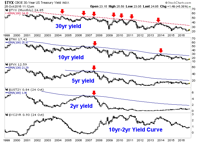
First, here is the state of yields and the yield curve currently, on the big picture view. Trends are down in the deflationary continuum on the biggest picture for all items, but have been neutral on the 5yr and somewhat up on the 2yr ever since Goldilocks gulped the bears’ porridge in 2013. The yield curve is in a downtrend.
If there’s one clear downtrend out there (which has been in place for – what – decades now?) it’s interest rates, in spite of all the blather about “normalization” (news flash: it ain’t gonna happen, folks). Here’s the $TNX, with the persistent series of lower highs marked:

