Slope of Hope Blog Posts

Slope initially began as a blog, so this is where most of the website’s content resides. Here we have tens of thousands of posts dating back over a decade. These are listed in reverse chronological order. Click on any category icon below to see posts tagged with that particular subject, or click on a word in the category cloud on the right side of the screen for more specific choices.

Chart Analysis on EWH (by Mike Paulenoff)

By -

All of the action in the iShares MSCI Hong Kong Index (EWH) from the November 8, 2010 high at 20.24 into the March 17 low at 17.63 has the right look of a completed major corrective period.  If accurate, that means that all of the action since March 17 (at 17.63) is part of a new upleg within the dominant, powerful uptrend.  Last Thursday's low at 18.79 ended a minor pullback ahead of a thrust that should confront the November 2010 to May 2011 resistance line, now at 19.56.  If hurdled, this should trigger upside follow-through to new highs.

Only a decline that breaks last Thursday's low will begin to compromise the timing of the anticipated next unplug.

Wgtvo8eqW
Originally published on MPTrader.com.

Hedging Macro Trend Risk

By -

Hey fellow Slopers,

My largest long position is an Australia-based nano cap I've mentioned in the comments on occasion, Alloy Steel International (Pink Sheets: AYSI). AYSI uses a high tech, proprietary process to manufacture protective wear plates for mining equipment. Essentially, the company is a picks & shovels play on the mining industry (particularly iron ore and coal mining). As such, it has the potential to benefit from the macro trend of Chinese demand for those commodities.

As is typical of nano caps, there are no options traded on AYSI, so it's impossible to use options to hedge against AYSI's idiosyncratic, or stock-specific risk — some of which it has exhibited over the last week, as the stock dropped 25% after reporting a sequential drop in earnings in its fiscal Q1, following its release of record Q4 and annual numbers in February:

The way I try to manage AYSI's idiosyncratic risk is by keeping my cost basis low (e.g., by buying more when the stock tanked to the low .40s last year, and not buying more when it spiked to $1.89 earlier this year, after releasing its 2010 numbers). How to hedge against its macro trend risk though, i.e., a big dropoff in Chinese commodity demand?

One way is to look for an optionable stock that's exposed to the same macro trend risk. BHP Billiton (NYSE: BHP ) fits that bill here (and is also a good fit for another reason: it's one of AYSI's largest customers). If you've got a position in AYSI, you could look at an equivalent dollar amount position in BHP and consider buying optimal puts on it as a hedge against macro trend risk. Using Portfolio Armor (available as a web app and as an Apple iOS app), you could simply enter "BHP" in the symbol field, your dollar-equivalent number of shares in the "shares owned" field, and the maximum decline you're willing to risk in the "threshold" field, and then Portfolio Armor would use its algorithm to scan for the optimal puts to give you that level of protection at the lowest cost. What number should you use as a maximum decline threshold though? 

In previous posts on hedging, I mentioned that I often use a 20% decline threshold when hedging (i.e., I hedge against a greater-than-20% loss), and that I got that idea from a comment fund manager John Hussman made in a market commentary in October 2008:

An intolerable loss, in my view, is one that requires a heroic recovery simply to break even… a short-term loss of 20%, particularly after the market has become severely depressed, should not be at all intolerable to long-term investors because such losses are generally reversed in the first few months of an advance (or even a powerful bear market rally).

I wouldn't use a 20% threshold in this case though. If there's a big dropoff in Chinese demand for iron ore, I'd expect a much bigger decline in BHP's share price. How much of a decline? Take a look at the 5 year chart of BHP below. 

The lows of late '08 could be attributed to the general end-of-the-world atmosphere post-Lehman, so I'd start with BHP's share price in Q1 '09. By the end of Q1 '09, some of the immediate panic of the global financial crisis had lifted, but there were still fears about a dropoff in Chinese commodity demand. At its lows in Q1 09, BHP was trading at about 10x its trailing earnings. Currently, it's trading at about 16.5x its trailing earnings (of $6.13). So if BHP's valuation dropped to 10x its trailing earnings today, the stock would be trading at $61.30, about a 40% drop from BHP's closing price Wednesday of $101.16. So I'd use 40% as my threshold if I were looking for optimal puts on BHP as a hedge against the macro trend risk of a dropoff in Chinese iron ore and coal demand.

Checking Portfolio Armor now, the cost of hedging against a >40% drop in BHP over the next seven months, using the optimal puts for that, is 0.86% of your position value. I may pick up a few of those optimal puts this week, while the VIX continues to hover near its two-year lows.

Top versus Pullback (by Springheel Jack)

By -

A good question was asked yesterday, and the question was why I and others were regarding this as a pullback rather than a move down from a major top. There are several reasons why that is. Firstly equities are clearly in a strong cyclical bull market, and the bull trend has to be given the benefit until demonstrated otherwise. Secondly this bull market has been fuelled and boosted to a very significant extent by negative real interest rates and, much more importantly, quantitative easing on an vast scale. QE2 doesn't finish until the end of June, and equities didn't top for a month after the end of QE1 in March last year.

I'm expecting equities to struggle after the end of QE2, but I'd be surprised to see a major top much earlier. Thirdly the pullback we've seen so far is still within the normal limits that we would expect to see for a pullback within a bull wave up. There are some worrying signs that this may go further, but no serious lines have yet been crossed as yet, and there's no great reason to think that they will be.

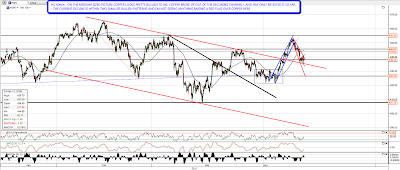
In terms of bull/bear indicators copper broke up from a declining channel a few days ago, and that was very bullish. Copper's retracing now, but hasn't done more than retest the upper trendline of the broken declining channel. The current retracement is also within two bullish (albeit weakly bullish) patterns, suggesting that it is just a retracement. That may change, but that's where copper is now. Here it is on the 60min chart:
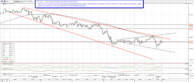
Looking more closely at copper on the 15min chart you can see the two bullish patterns for the retracement. I'm expecting a fairly big move on a break up though the targets are only 453 for the wedge and 450 for the broadening bottom.  :
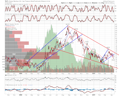
Looking at other indicators I've been watching bond prices, and there was a serious chance that a major low had been made in February. As you can see from the TLT daily chart though, the rally failed at declining resistance from the high last August, and while that trendline holds the presumption has to be that the move up was a rally within the greater downtrend. As bond prices are fairly strongly inversely correlated with equities, that still supports an ongoing equities uptrend:
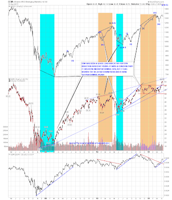
I also watch EEM as a lead indicator for equities, and there as well we saw a bullish break up in the couple of weeks. The current retracement has only retested the broken trading range ceiling so far:
On SPX I've mentioned a few times that the obvious target for a pullback was the daily 20 SMA, and we hit that yesterday and closed back above it. There's nothing remarkable about that so far and in any case there is strong support just below in the 1300 – 1305 SPX area. If we see a close below there that would look considerably more bearish:

Now that's not to say that there aren't some worryingly bearish charts here. The Russell 2000 daily chart is a concern, as there is a clear island top there, and an obvious target in the 800 area where a larger island top could also be established. There's also a potential HS pattern forming if RUT makes it back to 775.90. As yet there's no reason for real concern though and looking at the premarket, RUT could well negate the current island top today by moving back above it:
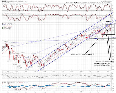
Overall there's not a lot to see on the bear side on the bigger picture so far, and I'll only be looking harder at that if we see SPX move back below 1300. Until then this just looks like another dip to be bought.

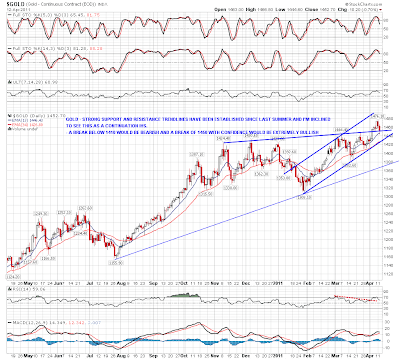
The last chart for today is the gold chart. I posted the strong resistance trendline, and possible continuation IHS neckline a couple of weeks ago, and here's the updated chart. Gold had a significant pullback this week, but so far the broken resistance trendline has acted as support. We'll need to see a close below that trendline to raise a potential warning flag for a significant pullback there:

 

Sotheby’s and Bull Markets

By -

I read a very interesting article this week illustrating how bull manias were closely correlated with Sotheby's stock price (ticker symbol BID). The article quite convincingly illustrated that the late 80s takeover mania, the dot-com boom/bust, and the real estate/credit collapse all lined up nicely with auction insanity and record-high art prices.

The thrust of the article was that the present mania is located in China, where vases and paintings are fetching unheard-of bids. The implication, naturally, is that China is heading for a cliff. And, as past examples of have, Sotheby's can lose about a third of its value in one session when speculation in art ceases.

Below are the charts of the S&P (blue) and Sotheby's (black).

0407-bid
