Slope of Hope Blog Posts

Slope initially began as a blog, so this is where most of the website’s content resides. Here we have tens of thousands of posts dating back over a decade. These are listed in reverse chronological order. Click on any category icon below to see posts tagged with that particular subject, or click on a word in the category cloud on the right side of the screen for more specific choices.

Will AAPL Stabilize Around 400-420ish?

By -

We didn't see the bounce in AAPL that I was wondering about in my post on January 5th. Momentum continued to the downside and price has pushed down to around 440 as I write this article around mid-day on Friday.

AAPL is still underperforming the NDX, as shown on the Weekly ratio chart below.

Price is approaching a 50% Fibonacci fanline at around the 420ish level, as shown on the Weekly AAPL chart below.

Major support lies somewhere around the 420-400ish level. It will be interesting to see if price begins to level out there, especially as it has now broken below its large uptrending channel from the 2009 lows.

Apple Inc. has also lost its place as the most valuable company in the world to Exxon Mobil.

Commodities Poised For a Bounce? (by Strawberry Blonde)

By -

An e-mail from one of my Blog readers this weekend inspired me to write about the following…so, first of all, thank you, kind reader, for writing.

With price sitting just above a major uptrend line from the 2007 lows, as well as horizontal price support, this Weekly ratio chart of DBC:SPX shows that price may be due for a bounce on DBC, theCommodities ETF. If price can rally, break and hold above, firstly 0.02 where there is a convergence of resistance of the 50 sma (blue), 78.6% Fibonacci retracement level, and a short-term downtrend line, it has a chance to reach the 0.022 level, which is currently sitting just above the 200 sma (red), and, potentially, the 61.8% Fibonacci retracement level just above 0.023, or higher.

If equities weaken, we may see this scenario occur. However, we could also see cash flowing into both equities and commodities. It may be that money is/will be flowing out of Bonds to fund such activity…I last wrote about 30-Year Bonds in my post of January 18th…they are worth tracking over the next week(s)…with the Fed busy buying Bonds, it may be difficult to determine how much private money is flowing out of them…time will tell, as may the charts. One thing that may provide a clue on this is if we see increased buying volumes on equities and commodities and increased selling volumes on Bonds.

(more…)

Money Flow for January Week Three (by Strawberry Blonde)

By -

Further to my last weekly market update, this week's update will look at:

  • 6 Major Indices
  • 9 Major Sectors
  • 3 Days/Candle Charts on 7 Major Indices
  • Index/Volatility Ratio Charts and AAPL:NDX Ratio Chart
  • 30-Year Bonds
  • U.S. $

6 Major Indices

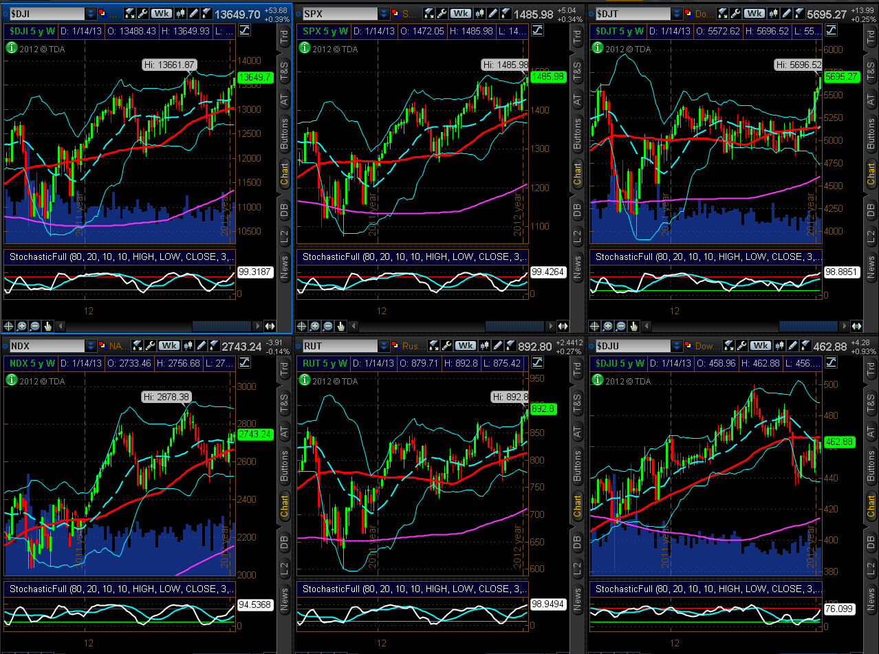
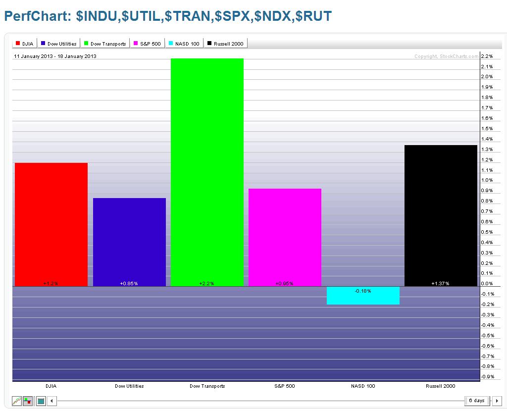
As shown on the Weekly charts and 1-Week percentage gained/lost graphs below, all but one Major Index closed higher on the week than the prior week. The Dow Transports Index gained the most, while the Nasdaq 100 lost a minor amount.

(more…)

Major Index/Volatility Ratio Update (by Strawberry Blonde)

By -

I last wrote about the comparison of three Major Indices with their Volatility Index counterparts on January 4th. While that post looked at a longer time period and mentioned major support and resistance levels, I'll provide an update for the shorter term.

As shown on the 1-Year Daily ratio chart below of the SPX:VIX, price closed on Friday at new highs. The Momentum indicator is still rising, but is approaching overbought territory — cautioning that we may see a minor pullback in the near future, although there is no negative divergence. If we do see a minor drop, followed by a higher swing high in price on negative Momentum divergence, we may then see a larger pullback — if not, then I'd look for a further rally in the SPX.

(more…)

Money Flow for January Week Two (by Strawberry Blonde)

By -

Further to my last weekly market update, this week's update will look at:

  • 6 Major Indices
  • 9 Major Sectors
  • Ratio Charts comparing the SPX to other Major World Indices
  • Fed Monetary Stimulus Program "Canaries"
  • Social Media Stocks and RIMM
  • U.S. $
  • 30-Year Bonds
~~~

***PLEASE NOTE that in the interest of conserving space on this post, I've provided links only to my charts and graphs again this week.
~~~


(more…)