Data released this morning shows that:
- the price of goods and services (excluding food and energy) has increased
- personal income has declined
- personal spending has increased
as shown on the three graphs below.

Slope initially began as a blog, so this is where most of the website’s content resides. Here we have tens of thousands of posts dating back over a decade. These are listed in reverse chronological order. Click on any category icon below to see posts tagged with that particular subject, or click on a word in the category cloud on the right side of the screen for more specific choices.
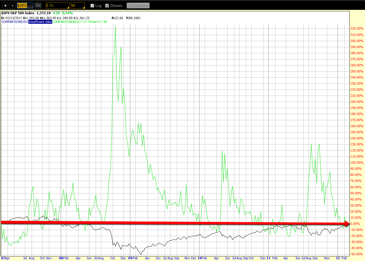
The 5-Year Weekly chart below shows a comparison of the S&P 500 Index to the VIX. We can see what can happen when price has traded around the levels at which they are currently situated. On each of the past four years, price has spiked rather quickly from these levels by large percentages on the VIX, sending the S&P 500 plunging.
Data released this morning shows that the selling price of homes continues to decline, as shown on the graph below. Since it's a "leading indicator of the housing industry's health because rising house prices attract investors and spur industry activity," this only adds fuel to the unfolding story of slowing demand/growth in 2012.
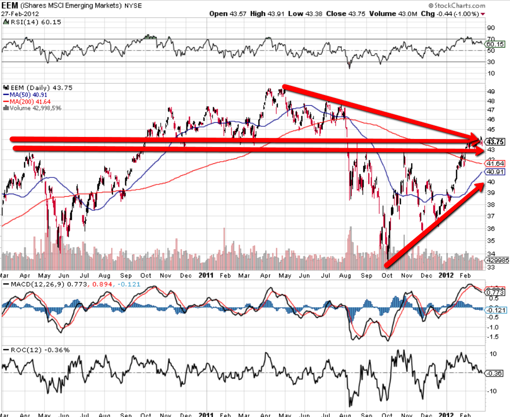
Below are a series of 2-Year Daily charts. I'll be comparing the current levels of the Emerging Markets ETF (EEM) with those of the BRIC countries for the purpose of determining relative strength of each.
The first chart is of the EEM. Price is currently in a trading range just below major resistance established in the first half of 2011 and just above major support established in the second half. There are negative divergences on the RSI, MACD, and ROC indicators, as well as declining volumes. Price is still subject to the influences of the existing bearish 50/200 sma Death Cross formation, and will be until such time as price breaks and holds convincingly above major resistance, and the moving averages cross to form a bullish Golden Cross pattern.