Slope of Hope Blog Posts

Slope initially began as a blog, so this is where most of the website’s content resides. Here we have tens of thousands of posts dating back over a decade. These are listed in reverse chronological order. Click on any category icon below to see posts tagged with that particular subject, or click on a word in the category cloud on the right side of the screen for more specific choices.

DBC in Between a Rock and a Hard Place

By -

The Commodities ETF (DBC) began and ended today (Tuesday) at
the apex of and in between trendline resistance and support, as shown on the
Daily chart below…an important one to watch tomorrow and thereafter!

An indication of weakness would likely be confirmed by a failure of
AUD/USD to regain and hold above 1.05, along with further
weakness in China's Shanghai Index, as discussed in my posts of
August 17th and August 15th.

A View of EUR/USD in 500 pip Segments

By -

Each candle on the chart below of the EUR/USD
forex pair represents 500 pips. The current candle bounced from
a Fibonacci and price confluence support level on July 10th of this year and has
rallied 446 pips, so far. Should it continue to advance by a total of 500 pips,
it would put price at 1.2541, which is at a confluence of price and Fibonacci
resistance.

You can see that this 500 pip level, as depicted by
the two white horizontal lines, represents a major level of support and
resistance
. A break and hold either above or below this "500
pip zone"
would set the stage for the next move up or down over the
ensuing days/weeks…an important zone to monitor.

Money Flow for August Week Three

By -

Further to my last weekly market update, this week's update will look at:

  • 6 Major Indices
  • 9 Major Sectors
  • SPX:VIX and RUT:RVX ratio charts
  • Major World Indices
  • Commodities
  • 7 Major Currencies
  • Commodities ETF (DBC) and AUD/USD Forex pair
  • 30-Year Bonds
  • Lumber and the Homebuilders ETF (XHB)

The Daily chartgrid below of the 6 Major Indices shows that, with the exception of the Dow Utilities Index, all made higher closing highs on the week.

(more…)

The “Rush to Crush” Volatility

By -

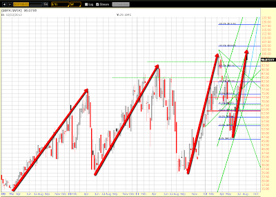
The two Weekly ratio charts below depict the SPX vs VIX and the RUT vs RVX.

Very simply, you can see that each rally made by these two Indices since the lows of three years ago has produced an increasingly steep advance before it pulled back. The current rally from the June lows of this year is almost starting to exhibit a "parabolic" steepness to it. It may run for awhile yet before potentially plunging. However, volumes these past couple of weeks has been very low, and whether this is a precursor to a change in trend remains to be seen.

Price on both charts has reached the top of a channel. The current rally may have run out of steam, and we may see price either pull back or consolidate at the highs to produce more of the same kind of roller coaster intraday activity that we've seen recently. Alternatively, we could see an acceleration of the rally to an even greater parabolic steepness, but I would expect that higher volumes would have to enter these markets to produce this kind of scenario. Near-term support levels are 95.00 on the SPX:VIX and 40.00 on the RUT:RVX.

These are important ones to watch over the coming days/weeks, particularly in the run-up to the Jackson Hole Symposium from August 30th to September 1st, and the FOMC Meeting results and Fed Chairman's press conference on September 13th (as well as the Eurogroup Meetings on September 15th and the European Council Finance Ministers Meeting on September 16th).