Further to my
last weekly market update, this week's update will look at:
- + 6 Major Indices
- + 9 Major Sectors
- + Ratio charts of SPX:VIX and RUT:RVX
- + Commodities ETF (DBC)
- + U.S. $ (DX)
- + 30-Year Bonds (ZB)
All 6 Major Indices ended the
week lower, as shown on the Weekly charts and 1-Week
percentage lost/gained graphs below. The largest losses were incurred
by the Nasdaq 100, followed by the Dow 30, S&P 500, Russell 2000, Dow
Utilities, and Dow Transports.
All 9
Major Sectors ended the week lower in a "risk-off" environment, as
shown on the Weekly charts and 1-Week percentage
lost/gained graphs below. The largest losses were incurred by the
Consumer Discretionary Sector, followed by Technology, Materials, Health Care,
Industrials, Energy, Consumer Staples, Financials, and Utilities.
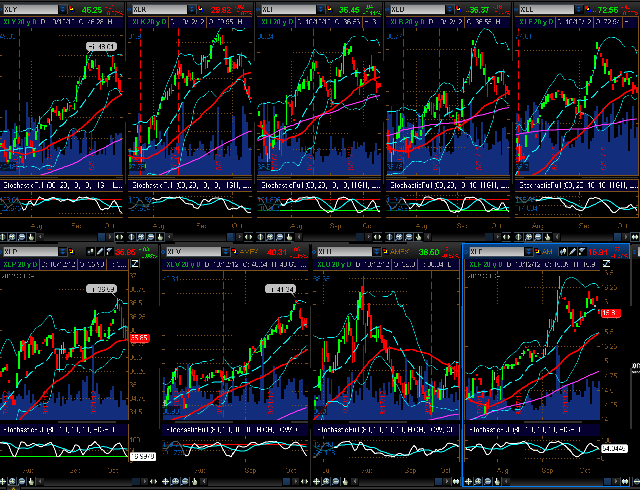
I've added the
following Daily charts of the Indices and
Sectors, as I would note that, generally, the Stochastics
Indicator has reached an oversold condition on most of them, but it has not yet
turned up…one to watch in the short term for any signs of stabilization or
reversal of this latest pullback…otherwise, look for more selling in the
week(s) ahead.
The following
Daily ratio chart comparing the SPX to its Volatility
Index (VIX) shows that price has, once again, closed below the
bottom of its uptrending channel, but is resting on an uptrend line. The
Momentum Indicator is just above the zero level, but it made a lower low on the
prior price pivot low. A close and hold below the trendline should produce
further selling in the SPX.
The following
Daily ratio chart comparing the RUT to its Volatility Index
(RVX) shows that price has also, once again, closed below the bottom of
its uptrending channel, but is resting on horizontal price support. The Momentum
Indicator is also just above the zero level, and it made a lower low on the
prior price pivot low. A close and hold below its immediate support level should
produce further selling in the RUT.
Generally, nothing is
indicating that buying in equities will resume next week, although we may see a
pause to relieve a bit of an oversold condition on the Daily timeframe. A rise
in Volatility will confirm continued bearishness, so it will be an important
indicator to monitor.
Of interest is the fact that, although a
bearish "Death Cross" has not yet formed on the SPX Monthly timeframe, we have
one now on the ES (S&P 500 E-mini Futures Index) Monthly. As such,
further selling may be in store for equities.
As shown on the
Daily chart below, the Commodity ETF (DBC) has
closed at a convergence of its falling mid-Bollinger Band, rising 50 sma (red),
and year-to-date Volume Profile POC (horizontal pink). After putting in
three bearish "evening star" formations and a tightening of its
Bollinger Bands, it is signalling that it may be in for a further pullback. A
close and hold below its lower Bollinger Band should produce such a
sell-off.
The
80.00 level shown on the Weekly chart of the
U.S. $ below represents a high level of interest, as it is
currently at a confluence of intersecting Fibonacci fanlines, 50 sma (red), 200
sma (pink), (50 is still above 200 in its bullish "Golden Cross"
formation on the Weekly timeframe), and the Volume Profile POC. Price
closed on Friday just below this 80.00 level. It will be necessary for
the $ bulls to reclaim and hold this level, since a bearish "Death Cross" has
just formed on the Daily timeframe.
30-Year
Bonds closed out the week above a confluence support level of the
mid-Bollinger Band, Fibonacci fanline, and uptrend line on a "Bullish
Engulfing" candle, as shown on the Weekly chart
below. There is nothing to indicate that wide-spread selling has begun in this
Bond, nor that a shift in trend is about to occur. I do see, however, that a
"diamond" pattern is emerging, which may simply represent a
continuation pattern rather than a reversal…time will tell which scenario
completes.

In
summary, if we see a major breakdown in Commodities and a rally in the
U.S. $ and 30-Year Bonds, we may see a further pullback in equities, and there
will be a rise in Volatility. Since next Friday is Options Expiration, the FOMC
meeting is the following Wednesday, and we're now in Q3 Earnings Season, we may
see some volatile intraday swings between now and then, particularly as tension
builds heading into the U.S. Presidential election on November 6th, along with
public and political/economic/fiscal unrest in some Europe countries and rising
tensions in the Middle East and between China
and Japan. No doubt, the markets will look for defensive measures to protect
against such threats to any resumption of a bullish equity bias in the short
term, or even just a hedge against further losses on more selling. In any event,
it's bound to get interesting.
Enjoy your weekend and good luck next
week!
SB's DISCLAIMER: The information contained within
my posts may not be construed as financial or trading advice. Please do your
own due diligence before engaging in any trading activity.