Slope of Hope Blog Posts

Slope initially began as a blog, so this is where most of the website’s content resides. Here we have tens of thousands of posts dating back over a decade. These are listed in reverse chronological order. Click on any category icon below to see posts tagged with that particular subject, or click on a word in the category cloud on the right side of the screen for more specific choices.

FTSE 100 Index Facing Major Headwind Resistance (by SB)

By -

In my post of July 25th, I pointed out that Britain's
FTSE 100 Index
was trading around a major price support/resistance
level of 5500. It subsequently bounced from there and has risen to the top of
the large "Diamond" pattern (which, I mentioned, has been
forming from 2009/10…and is, potentially, a topping pattern with a
1300 point range
).

The updated Daily chart
below shows market action, to date (October 18th's close). Price is
facing immediate major headwind resistance
from the upper edge of this
Diamond pattern, along with negatively-diverging RSI, MACD, and Stochastics
Indicators…one to watch for a potential breakdown, as the 1300 point range is
substantial.

I'm mindful of the
fact that Britain is also facing a 9 billion pound debt
incurred from hosting the 2012 Olympic Games, as it struggles
with a double-dip recession, severe public spending
cuts
, and an unemployment rate of 7.9% (as reported here on October 17th and shown on the graph
below)…adding, enormously, to the above headwinds.

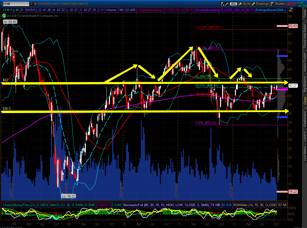
EEM Weekly H&S and Daily H&S Patterns (by SB)

By -

Below are a Weekly chart and Daily chart of the Emerging Markets ETF
(EEM)
.

A very large Head and Shoulders pattern
has been building on the Weekly timeframe since September 2009.
Price is retesting a zone in the vicinity of the right shoulder and appears
poised for another attempt at a break above.

Within the right
shoulder is another smaller Head and Shoulders pattern, which
has been building since August 2011 on the Daily timeframe.
Price is retesting the September 14th "shooting star," the high of which
represents the top of the right shoulder (which is still forming) on this timeframe. Furthermore, a
bullish moving average "Golden Cross" formed two days ago, and,
once again, price closed just above the 50% Fibonacci retracement level today.
Volumes have picked up a bit over the past couple of days.

If price
breaks and holds above 43.00, the next level of resistance is
the top of the Daily "head" and Weekly "right shoulder" at
44.91 (if it can make it above the 60% Fib level at
43.93).

You can see how
EEM is performing compared to the BRIC
countries
, as shown on the 6-Month Daily charts below.
If we see India and China weaken, we may see the others, including EEM,
follow suit. All five bear a close watch over the next few days, as any
weakening, in the near-term, may negatively affect U.S.
equities.

The Ever-Growing Tech Bubble…You’ve Been Warned! (by SB)

By -

Once again, another bubble grows as the spread between the NDX
and S&P 500 and also between these Indices and their
respective Volatility Indices continues to widen, bringing with
it unresolved volatility repercussions, as shown on the 20-Year Daily
percentage comparison chart
below. The last two bubbles didn't end well
for both Indices, as their collapses were swift and deep, cannibalizing
virtually all of the gains that were made within both bubbles.

Technology
has risen from the 2009 lows more, in percentage-terms, and faster, than it
did from the last bubble lows to highs, thanks to the non-stop money-printing
programs that have been enacted by the Fed since 2009. However, the Fed, alone,
cannot save a potential collapse of the current bubble, particularly within the
confines of the challenges facing the current slowing global economic
environment, along with growing domestic and international political/fiscal
discord, which were not factors prior to the last bubble collapse.

You've been warned…please don't shoot the messenger!

Comparison of S&P 500, Russell 2000, Gold, and Oil (by SB)

By -

I thought I'd look at the S&P 500 and Russell 2000 Indices, Gold,
and Oil
to compare where they are trading on a 1-Year Daily timeframe
relative to their 50 sma and on a 3-Year, 1-Year Daily, and 11-Day timeframe
relative to each other.

The first chartgrid shows a 1-Year
timeframe
, with the SPX and RUT trading around their 50 sma, Gold is
above its 50 sma, and Oil is below its 50 sma. The second chartgrid shows a
2-Month close-up shot, with today's recovery into the close on
the SPX, RUT, and Oil. Gold closed near today's low. While the SPX and RUT have
made a new high during the past year (which is serving as near-term resistance,
thus far), Gold and Oil have not. The triple top on Gold at 1800 is serving as
major price resistance, while the 100.00 level is holding as major price
resistance on Oil (with the 50 sma holding as near-term resistance at
93.96).

(more…)