


To me, the most beautiful things in life are also the most mysterious.
This chart is all ye need know…….

Slope initially began as a blog, so this is where most of the website’s content resides. Here we have tens of thousands of posts dating back over a decade. These are listed in reverse chronological order. Click on any category icon below to see posts tagged with that particular subject, or click on a word in the category cloud on the right side of the screen for more specific choices.
To me, the most beautiful things in life are also the most mysterious.
This chart is all ye need know…….
……. to blind us to the truth.
I was looking at some interesting charts over the weekend and one of the most interesting was from chart of the day comparing job losses in the recession and recent 'recovery' to previous recessions and recoveries in the US. Here it is:

I have a free email subscription to chart of the day and in my opinion it is well worth signing up for. Here's the link to the full post with this chart:
How could it be that when compared to previous recessions and recoveries this 'recovery' is failing to produce the jobs that we would expect from past experience? The obvious answer is that the figures for GDP, inflation and unemployment that are issued nowadays aren't actually directly comparable to these previous examples, as the methods for calculating them have been changed so profoundly in the last three decades.
Shadowstats have some excellent charts calculating these figures on the basis that they used to be calculated, and they make grim reading. Here's the link to the alternate data page at shadowstats.
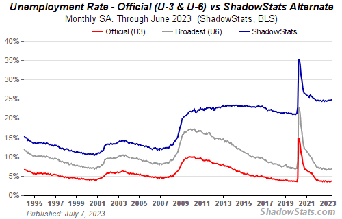
Here's the shadowstats take on the unemployment rate with the top line including the long term discouraged workers that were edited out of the figures in 1984:
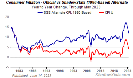
Here's the shadowstats take on the inflation rate with the top line using the method used to calculate CPI in 1980:
Here's the shadowstats take on the inflation rate with the top line using the method used to calculate CPI before Clinton's election:

Finally here's the shadowstats take on GDP growth once all the methodological 'improvements' made over the last thirty years have been stripped out:

Looking at the shadowstats charts the reason why jobs have failed to bounce back as they have in previous recoveries is simply because the reality is that on the same basis that those previous GDP figures were calculated, we have not yet started a recovery.
A powerful and pernicious idea took hold in the last two decades particularly, and it was that what was really important was not so much what was happening, but rather people's perception of what was happening. Spin became a central tool of government policy and inconvenient figures were massaged until they showed what policymakers wanted them to show.
The problem with that is that policy based on fantasy is unlikely to deliver much that is useful, and the best that can be managed is that people can be fooled into thinking that a high inflation and low growth economy that is going nowhere is an achievement rather than an escalating problem.
On the government's own unemployment figures, this recovery and the last one both look bogus, and they lend considerable weight to the shadowstats alternatives.
interzone posted a couple of links at slope that shed some light on the thinking of mainstream economists nowadays, with a comical attack by a Fed economist Kartik Athreya attacking economic bloggers lampooned here at Bruce Krasting's blog, and demolished by Ambrose Evans-Pritchard at the Daily Telegraph in the UK.
To a certain extent Kartik Athreya has a valid point. To the relatively untrained eye, it looks obvious that the path to sustainable prosperity has never been, and could not ever be, to borrow a lot of money that you cannot afford to repay, in order to buy goods and services that you do not need.
Only after years of training in current orthodox economic thinking might it appear otherwise.
There are no examples in history that I am aware of that would suggest that this strategy might work, and the largest and most obvious recent example where this has been done on a huge scale, in Japan, suggests just the opposite.
It is my belief that economists in twenty years will look back and wonder what the many economists like Kartik Athreya and Ben Bernanke were smoking to make them think that blowing up a series of asset bubbles with an orgy of debt was a good idea.
They seem likely to join the many other groups of trained experts historically who defended the orthodoxy of the day past all reason, only to see their ideas later ridiculed and consigned to the dustbin of history.
After today's drama, most folks are probably prepared to ride the new bull market back to Dow 20,000. My view is that days like today are just blips, and that when the bear market really does end, it will do so – – paradoxically – – in some cataclysmic way.
One Sloper took the time to put together an interesting table showing how various crashes led to subsequent wars. No one wishes for war (and I certainly don't; we've got two on our hands already, and those aren't exactly going very well), but if history is a guide, financial troubles usually lead to political ones as well.
|
Market Crashes |
|
War |
||
|
Name |
Year |
|
Name |
Year |
|
Tulip Bubble^ |
1637 |
—> |
First Dutch War^ |
1652 |
|
Bengal Bubble* |
1769 |
—> |
American Revolution* |
1175 |
|
Panic of |
1796 |
—> |
Franco-American |
1798 |
|
Panic of |
1857 |
—> |
US Civil |
1861 |
|
Long Depression* |
1873 |
—> |
Boer Wars, Anglo-Zulu War* |
1879 |
|
Panic of |
1893/1896 |
—> |
Spanish American |
1898 |
|
Panic of |
1907 |
—> |
WWI |
1914 |
|
Great Depression |
1929/1937 |
—> |
WWII |
1939 |
|
Recession of |
1973 |
—> |
Engaged in Vietnam |
1965-1973 |
|
Black Monday |
1987 |
—> |
No war |
— |
|
Dot-Com |
2000 |
—> |
War on Terror |
2001 |
|
Great Recession |
2008 |
—> |
? |
|
|
|
|
|
|
|
|
^ – Occurred in the Netherlands/involved the Netherlands |
|
|||
|
* – Occurred in England/involved England |
|
|||
A Sloper sent me this interesting graphic from the Martin Pring website. It aligns quite nicely with my Big Picture.
