Slope of Hope Blog Posts

Slope initially began as a blog, so this is where most of the website’s content resides. Here we have tens of thousands of posts dating back over a decade. These are listed in reverse chronological order. Click on any category icon below to see posts tagged with that particular subject, or click on a word in the category cloud on the right side of the screen for more specific choices.

Dead Cat Bounce? (by Springheel Jack)

By -

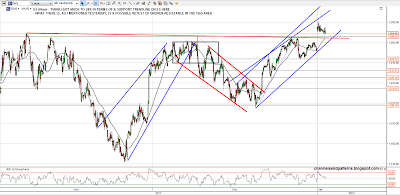
We've been having a lot of days where the low has been made about 10.30 and equities then rose for the rest of the day. Yesterday broke that with a bounce that petered out and then drifted downwards until the close. That doesn't mean that we've seen a top, but it is a change in the character of the market. On ES we have broken down from last week's rising channel into a shallower one. A break below channel support in the 1280 area would look immediately bearish. Channel resistance is in the 1308 area:

(more…)

Bank of Canada Business Outlook Survey

By -

The Bank of Canada released its latest Business Outlook Survey this morning. As referenced in the notes below (courtesy of www.Forexfactory.com), it's a leading indicator of economic health, affecting spending, hiring, and investment, and it can have predictive qualities regarding future economic conditions because the surveyed firms are selected in accordance with their composition of the nation's GDP.

The survey is shown in its entirety here: http://www.bankofcanada.ca/wp-content/uploads/2012/01/bos_winter2011.pdf

(more…)

Consolidation…. probably (by Springheel Jack)

By -

Obviously the pre-market high yesterday at 1280 ES held all day. ES and EURUSD were both looking short term overbought, and the hourly RSIs have now reset somewhat. I'm still wondering this morning about a possible retest of broken resistance at 1265 ES which I mentioned yesterday morning as a possibility. Much lower and I'd be wondering if we've seen a short term top yesterday morning:

(more…)

Adieu 2011 (by Springheel Jack)

By -

Well what a wild year this has been. Huge moves but a finish within spitting distance of where SPX began the year. I was looking through my many index charts this morning and found the following chart of the Wilshire 5000 that I probably did in very late June and hadn't looked at since. You can see the arrows marking where I thought the index might go from there. Very spooky. I suspect I did the chart on the morning of 30th June as I posted a similar SPX chart that day which you can see here. This Wilshire chart also underlines the very strong resistance at the level being tested now there and on SPX at the very important 200 day SMA:

(more…)