Slope of Hope Blog Posts

Slope initially began as a blog, so this is where most of the website’s content resides. Here we have tens of thousands of posts dating back over a decade. These are listed in reverse chronological order. Click on any category icon below to see posts tagged with that particular subject, or click on a word in the category cloud on the right side of the screen for more specific choices.

Portugal…The Eurozone “Poor Relative”

By -

Below are several charts and graphs (available at www.Stockcharts.com) comparing the German DAX, French CAC, Portuguese PSI, and Greek GRDOW Indices over three different time periods.

The first two are taken over the past three months. We can see on these that although the DAX and CAC began to rally in November, Greece continued to drop until last week, and Portugal has basically moved sideways from November.

(more…)

Touchdown in Sight for Dow 30?

By -

In my post on December 9th, 2011, I outlined a hypothetical scenario whereby if the Dow 30 played out over the next three days like it did on the 9th (it gained 200 points that day), we'd see the Dow reach 12800 by the close on December 14th for a "touchdown." Needless to say, it didn't work out within that time period; however, with today's close at 12720.48, that game plan is now within reach, provided it can push above a minor resistance level of 12754, as shown on the Daily chart below. The Dow has gained nearly 1000 points since the December 2011 lows. Near-term support is at 12600.

(more…)

YM, ES, NQ & TF Market Hours Only Charts

By -

Below are 90-day 60-minute market hours only charts of YM, ES, NQ & TF. Overlayed on each chart are Bollinger Bands (which are based on the 50 sma and deviations of +2.0 and -2.0), monthly Volume Profiles (red horizontal lines are POC), 200 sma (pink), Volume Profile for the 90 days at the right edge of the chart, and my short-term RSI indicator. I've chosen this timeframe to look at price action from the October 2011 lows during market hours only.

Price is pushing the boundaries of the upper Bollinger Band, and my RSI is showing a negative divergence from yesterday's and today's actions…ones to watch to see whether they return to the mid-Bollinger Band (50 sma) soon. Alternatively, in view of breaks and closes above near-term resistance levels that occurred today on the Major Indices (except Dow Utilities), as mentioned in my post of January 10th, we may see a parabolic rise culminating in exhaustion volumes before such a drop takes place.

(more…)

Major Indices Update (by Strawberry Blonde)

By -

The support and resistance levels for the Major Indices noted in my post on January 10th still apply.

In that post, I also made reference to a 10-Day 30-Minute chartgrid of the YM, ES, NQ & TF and said that any repeated attempts to advance convincingly beyond the highs of the first week in January would need to be accompanied by higher volumes. The horizontal white line on the updated chartgrid below represents that week's high. We can see that:

  • + the YM has struggled to stay above that level on building volumes, and today's advance took place in overnight trading on very low volumes…price fell back to the range high which is near-term support
  • + the ES has managed to stay above this range high, for the most part, on building volumes, and today's advance also took place in overnight trading on very low volumes…price is trading just above the 200 sma (pink) and last week's Volume Profile POC (yellow horizontal line) on this timeframe
  • + the NQ has also managed to stay above this range high, for the most part, on building volumes, and today's advance also took place in overnight trading on very low volumes…price is trading just below its 50 sma (red)
  • + the TF has also managed to stay above this range high, for the most part, on building volumes, and today's advance also took place in overnight trading on very low volumes…price is trading below both moving averages, just above last week's Volume Profile POC, and just above the 10-day Volume Profile POC (red horizontal line) at the right edge of the chart 

(more…)

Gold, Oil, Copper & Silver weekly & OPEX Charts

By -

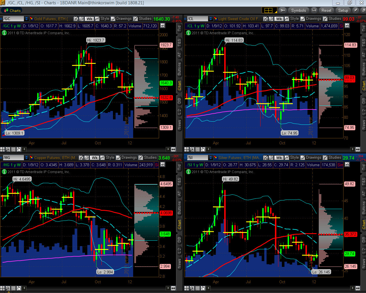
Below are Weekly charts during a one-year time period of Gold, Oil, Copper and Silver with Bollinger Bands, 50 sma (red), monthly Volume Profiles (horizontal yellow lines are POC), and a one-year Volume Profile at the right edge (red horizontal line is POC).

While Oil pulled back this past week to confluence support, Gold, Copper and Silver rallied. For this time frame, if Copper and Silver continue to rally, they will be returning to their "mean" (50 sma and one-year POC), and if Gold and Oil rally, they will be adding risk by moving away from their "mean." Volumes were higher last week, and potential targets on the upside are mid-to upper Bollinger Band, as follows:

  • Gold – mid-Bollinger Band at 1700ish
  • Oil – upper Bollinger Band at 107ish
  • Copper – upper Bollinger Band at 4.00ish
  • Silver – mid-Bollinger Band at 32.70ish 
(more…)